Review Map Custom Settings
Review Maps allow you to do a visual, interactive code review. As an author, you can walk your reviewers through your change with a Tour. As a reviewer, you can grasp the entire change at a glance, and review code in logical chunks. (So much better than alphabetical!)
Once Maps is installed on a repository, Review Maps will be automatically generated for every pull request made to the repository. There is also an “Install Review Maps” button on the /maps page to get you up and running.
Maps posted on GitHub PRs
By default, the maps posted on GitHub include both changed files and unchanged files. For some repositories, these images can become too cluttered to be helpful. No problem!
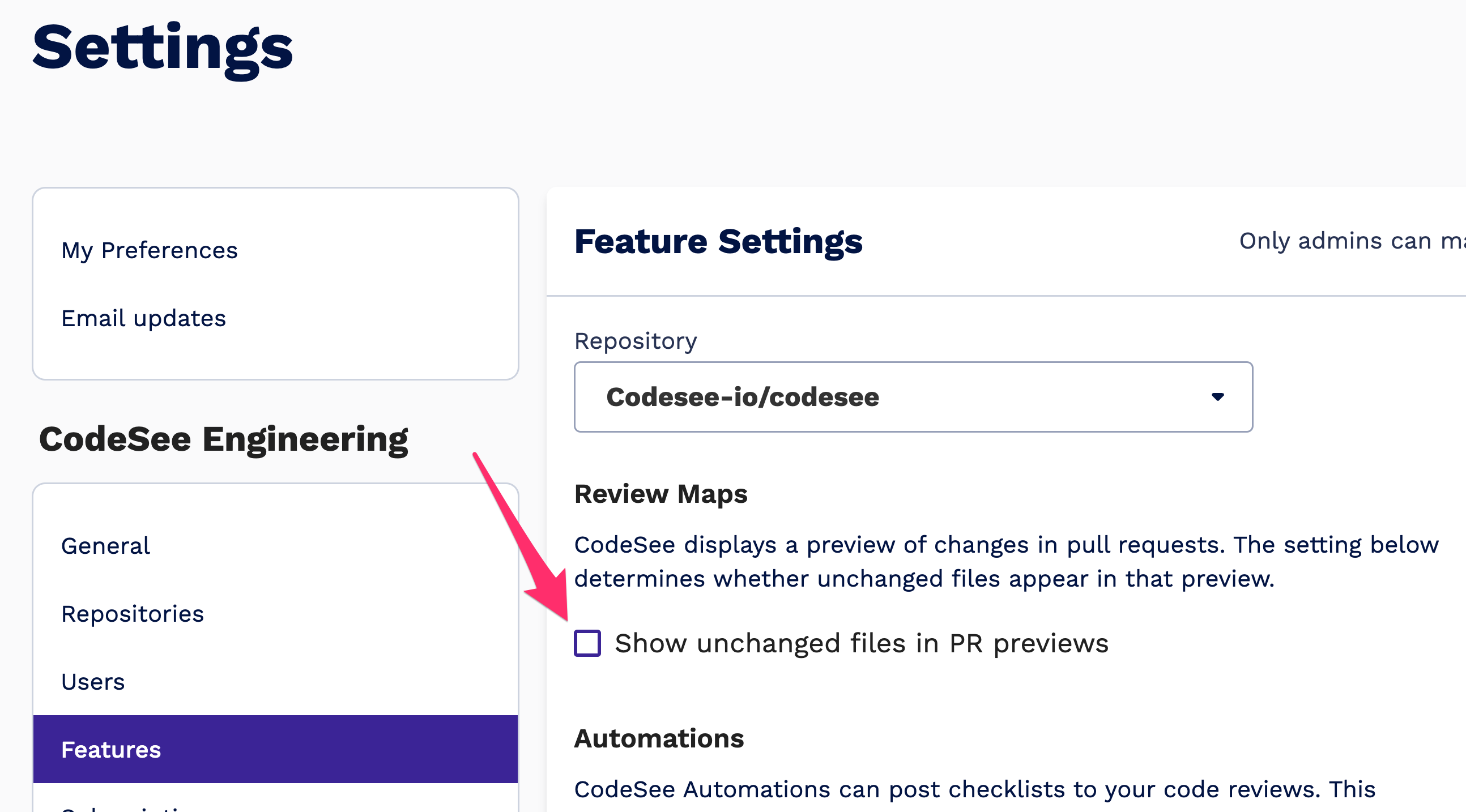
You can toggle off unchanged files by:
- going to Settings > Features
- selecting your repository in the dropdown
- unchecking the box next to "Show unchanged files in PR previews"

In-App Review Map Settings
When viewing a Review Map on CodeSee, the Review Map settings can be accessed by clicking the gear icon in the menu on the upper-right corner of the map:
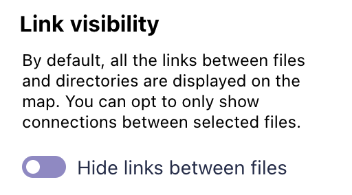
By default, all the connections between files and directories are displayed on a Review Map. To reduce visual clutter, turn on the "Hide links between files" setting. In this mode, you can still select files and directories to see the incoming and outgoing connections.

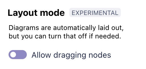
The layout of a Review Map is automatically generated. However, we've introduced an experimental flag that allows users to reposition files and directories by dragging them around the page.

Updated 12 months ago